Kalmont Rescue Website
Roles: I was the visual designer and coder in the project.
Tools: prototyped by using Figma and used HTML/CSS to make the prototypes a final website.
Teammates: Xiaoyue, Tianming, Nan.
Time Frame: Summer 2020.
Figma Link to Final Design Mockups
Web Link to Final Product
Overview: I created a set of rescue webpages with my teammates for a made-up town in British Columbia called Kalmont for school. The website provides up-to-date information such as weather forecasts, current events, and the latest news. Also, our website provides information about how to self-rescue when tourists face hypothermia or avalanche.
Personal Reflection: The project was The entire process taught me how to code using HTML/CSS, how to prototype using Figma, and the importance of collaboration. More importantly, this project gave me an idea about what UI/UX design is. In the future, I would like to do more user testing to improve the design.
Low Fidelity
I created some sketches to show the key elements and interaction paths in the webpages. There is a banner showing the logo and the name of the company. Then I designed two layouts to present the information in different sections.
Medium Fidelity
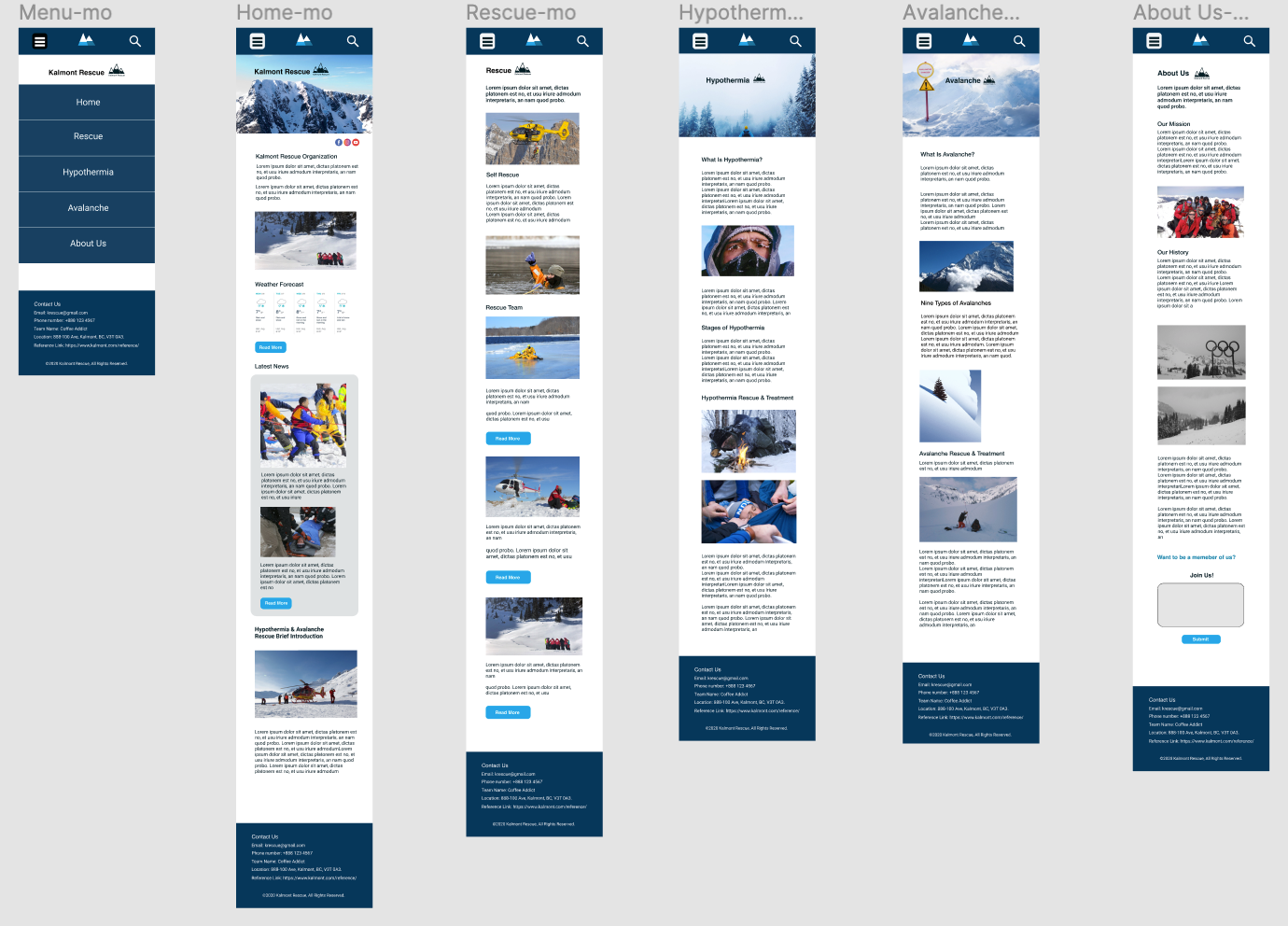
I picked the layout design with the drop-down menu to make grey box wireframes by using Figma. The news and weather forecast are the most important, so I placed them on the homepage with a brief introduction of the organization. Each button on the menu has its webpage, the purpose of the website is to offer the information and tell people what to do when the avalanche and hypothermia happen.
High Fidelity
The high-fidelity mockups were made by Figma. After crated the colourful interfaces, I prototyped them to see the interactions and tested the user experience between the pages. At the same time, and usage of HD images made the mockups more realistic. The colour palette that I chose here is mostly black and white because it could help keep the interface clean and fit the mountain rescue aesthetics.
Final Design
As a team, we changed the layout and the colour palette for the final version because the blue colour scheme could make the interfaces more lively and fit more the snow mountain aesthetics. We chose the design with the horizontal menu bar because it is easier for the users to navigate and catch the information. Meanwhile, the backgrounf colour of the banner was set to be completely transparent so that images can be highlighted. Individually, I coded the designed prototypes by using HTML/CSS/JavaScript.
In this stage, I learned how to communicate and to balance each team member’s design. The final design of the website fits the aesthetics of a rescue organization perfectly. And, it resulted in achieving an A level for this project.


